
What do you think is the most important factor in designing custom patches? Is it color? Size? Shape?
The correct answer is none of the above. The single most important factor is legibility. If someone seeing your patch can’t read it, your message is lost.
Sure, color, patch size and shape all are part of the equation, but the single most important factor in determining the legibility of your message is the font you choose. A good font makes all the difference. It conveys your message in a clear, attractive way.
Some Fonts Just Don't Work
Choosing the right font doesn’t have to be difficult. There are a few pitfalls, but a few basic points apply.
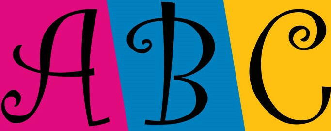
There are some fonts that just don’t work for patches. The “Curlz” font shown here, for example:
Note how the curlicues and flourishes on the A, B, and C hamper readability. The curvilinear shapes aren’t as immediately recognizable as simpler straight lines would be.
Another Example
And here’s another example, the “Bleeding Cowboys” font. Bad name, bad font. Notice how some of the letters fade to white, and how the whiplike flourishes detract from the letters they’re attached to:
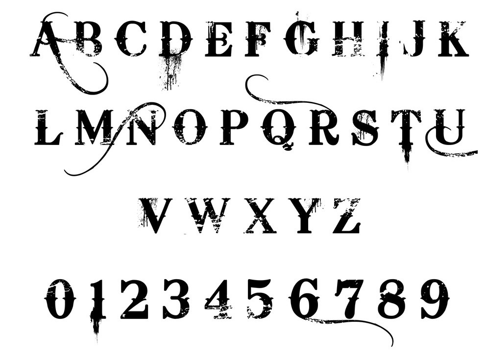
Even its creator is tired of that one, telling the Joplin Globe in 2017 that Bleeding Cowboys “is to fonts what Nickelback is to rock ‘n’ roll.” Make of that what you will.
So What Does Work?
The best fonts for patches are simple and clean. You want any text on your patches to be easily readable. Keep in mind that the size of both your patches and your lettering will affect the legibility of any font. The smaller you need your text to be, the simpler your font should be. Here’s an example of Garamond, a font that looks good and remains legible at just about any size:
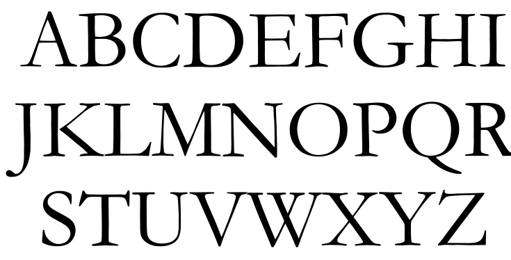
See? Simple and legible at a large or small sizes, with no distracting unnecessary swirls, curls or additions. Just an attractive, versatile serif font, a bit rounded, easily readable.
If You Need Small Text, Consider PVC Patches
PVC patches offer a substantial advantage over embroidered or woven patches for small text. PVC allows for smaller, more intricate lettering because it doesn’t require stitching, unlike embroidered or woven designs. That also gives you more space for other artwork or logos.
Art and text should work together to form a united style. A logo that contains lettering in one font and outside text in a different font can work quite well, but they must coordinate. Clashing fonts look sloppy, reduce legibility and limit the effectiveness of your desired message. An effective patch integrates all the components – text, art and color(s) – into a coherent whole.
Selecting the right font isn’t rocket science. A little common sense goes a long way toward creating a great looking custom patch that achieves your objectives. Our experienced graphic artists will be happy to help you find the right fonts, patch sizes and other details to give your patches the most impact. Call or email us today to find out more.