
When you look at our logo above, what do you think is the most important word? Patches? 4Less? (OK, that’s a word and a number, but you get the point.)
No. The most important word in our name is Custom. Our job is to give you patches made to your specifications, that look exactly the way YOU want them to.
There are several ways we do that. First, we listen to you. We hear your description, we see your drawing, sketch, doodle or other rendition of your desired patch design. Then we ask questions if we’re not sure exactly what you want. And of course, we send you a free digital proof for your approval before we start production of your order.
One thing we have to do to get your order right is match colors accurately. Whether you have an existing patch design or an idea for a brand new one, you have specific ideas about what colors you want.
Here’s the thing, though: we don’t always see what you see. Computer monitors vary in their color calibrations. A shade that looks red on our monitor might look pink on yours, for example. Or purple on one will be blue on the other.
That’s a problem for both of us. If you’re expecting pink on your custom patches and we embroider them in red, you’re not happy. And when you’re not happy, we’re not happy.
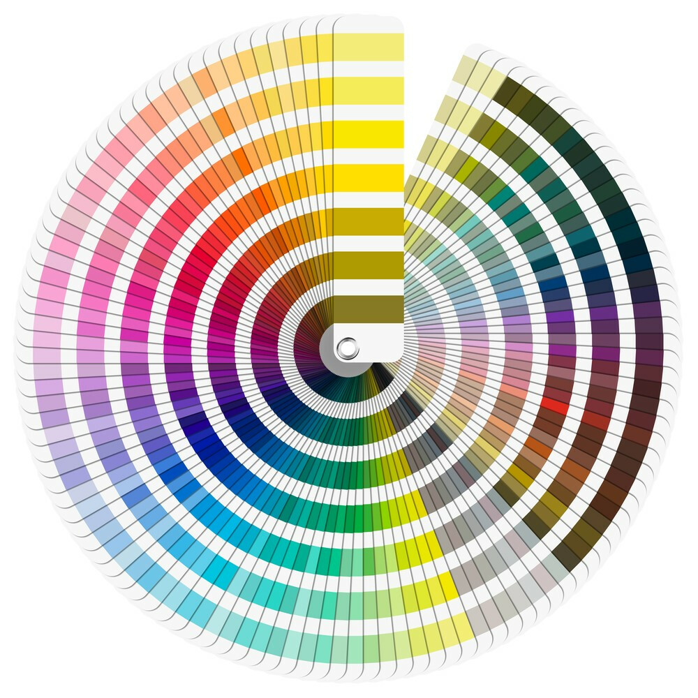
Fortunately, there is a solution. It’s called the Pantone® Matching System, or PMS.
Pantone is a company based in New Jersey that originated a color match system for printing, fashion, graphic design and other industries. It assigns a specific number to more than two thousand different colors. It gives us a common ground to specify color.
For example, let’s say you want a custom design in University of Florida Gator Orange It’s a bit dark, with a significant red component. But on our monitor, it shows up closer to University of Tennessee Volunteer Orange, a lighter shade with elements closer to pumpkin than red.
If we just relied on how things looked, we would produce your patches with the wrong color. But the PMS system solves that.
Pantone assigns Gator Orange the number 172C. Volunteer Orange is 151C. When you give us the number 172C, we know exactly which orange to use, and your patches turn out looking just the way you want. You’re happy, we’re happy.
Pantone color charts are readily available for review in most art supply stores and many public libraries, making it easy to check. We provide the Pantone number for every color in your design on your free digital proof. We’ll make sure we have your approval before production begins.
We’re always happy to answer questions about how we work! If you’d like to know more about how we use Pantone colors, or any other aspects of our production process, please don’t hesitate to call or email us. We’re here to serve all your custom patch needs!